Lately I’ve become obsessed with map infographics. I can spend hours searching on Google for maps about how the economy of China matches up with each individual state in the United States or maps about where movies were filmed from 1928 to 2008. These maps are full of information, numbers and strange facts that I feel like I need to know and over time I’ve collected quite a few of them and decided to share them with you. So, in no particular order, here are the maps.
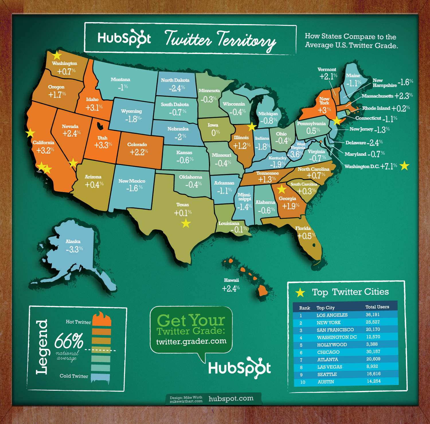 This first map discusses how the population of each state ranks on Twitter. Michiganders are not very popular Tweeters. There is also a website called Tweet Grader where you can learn how popular you specifically are on Twitter. Just to give you an idea, I didn’t even register on Tweet grader. Mr. MVP showed up, but he is not ranked and he has 217 followers. You can also supposedly find out who started on Twitter the same day as you, but I could not get the link to work.
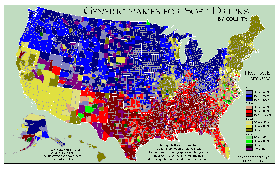
Just because we don’t drink soda in our house doesn’t mean I don’t enjoy an amazing interactive map with enabled voting showing the different counties spread across the United States on the different usage of the words pop and soda. Pop vs Soda is an addictive map where you can vote and then learn about what the sugary stuff is called in your neck of the woods.

These next maps are a little morbid, but they are absolutely lovely at the same time. John Nelson, a Michigan designer took information from the National Highway Traffic Safety Administration and compiled it into these striking maps that allow you to see the number of driving fatalities, not only in each state, but pinpoints the cause and the time of day.
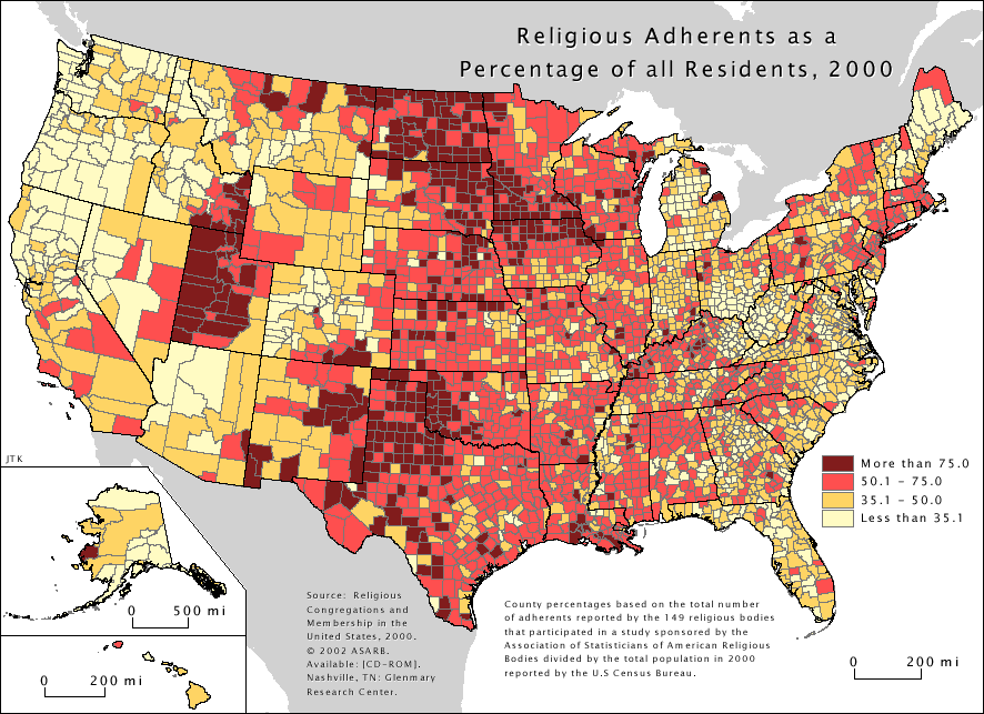
The Association of Religion Data Archives has an entire map section that is enthralling. As a semi-non religious person it was super interesting to be able to create a custom map for my specific zip code, switch everything around and recreate a map for my old religion, and then change things again and find out who exactly is practicing what religion in Michigan. Click on the link to create custom maps of your own.
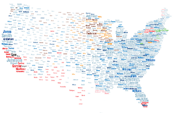
National Geographic made this interactive map of surnames showing us all how similar we really are. When I zoomed in on the map I noticed that Jackson, Wright and Davis are the most popular names in my area, which made me laugh because I actually know people with all three last names.
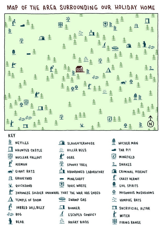
This next map can be found at Strange Maps and was created by Tom Gauld. It depicts a summer holiday adventure and I freaking love it. I want to print this map out and hang it on the wall I love it so much. This map has character and humor and shows the absolute creativity that comes only after sheer boredom sets in. Best of all, this map reminds me of my summers on Pine Lake in Delton, Michigan and at Shabby Cabin on Lake Michigan as a child.
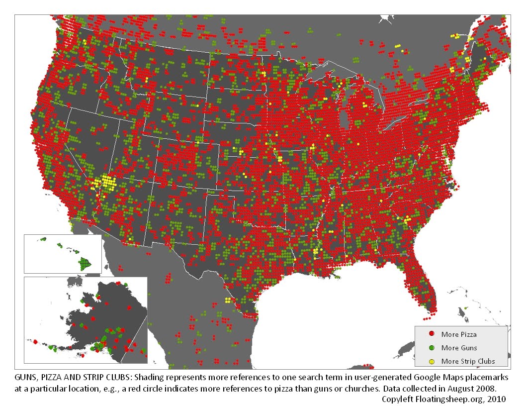
Floating Sheep did this map about our love of pizza, guns and strip clubs. They are also responsible for this awesome map about church and beer. It looks from the pizza map that pretty much everybody likes pizza and after zooming in I noticed a weird cluster of green, or more guns, directly over my house. Strange. What I don’t see that gives me hope is yellow, or more strip clubs.
Today I am sharing seven maps with you. I’m almost embarrassed to tell you that I have 46 maps bookmarked. As I said before, I kind of love knowing things. So, if you haven’t already, click on all the links, explore the maps and zoom to your heart’s content. If you want, bookmark this page for later, who am I to judge?
About The Author
Nicole
Member of Team VP, knitter and Mama to Blue and Franks. Life, is bloody good.